FITNESS
POWER+
Power+ is a fitness apparel company with a goal to inspire their community of young fitness enthusiasts to always grow in and out of the gym. To reach their target audience and increase sales, the company needed a brand identity that makes their community feel empowered. The goal was to connect with their community and inspire them through a BOLD, POWERFUL and GO-GETTER Mentality.
Brand Identity
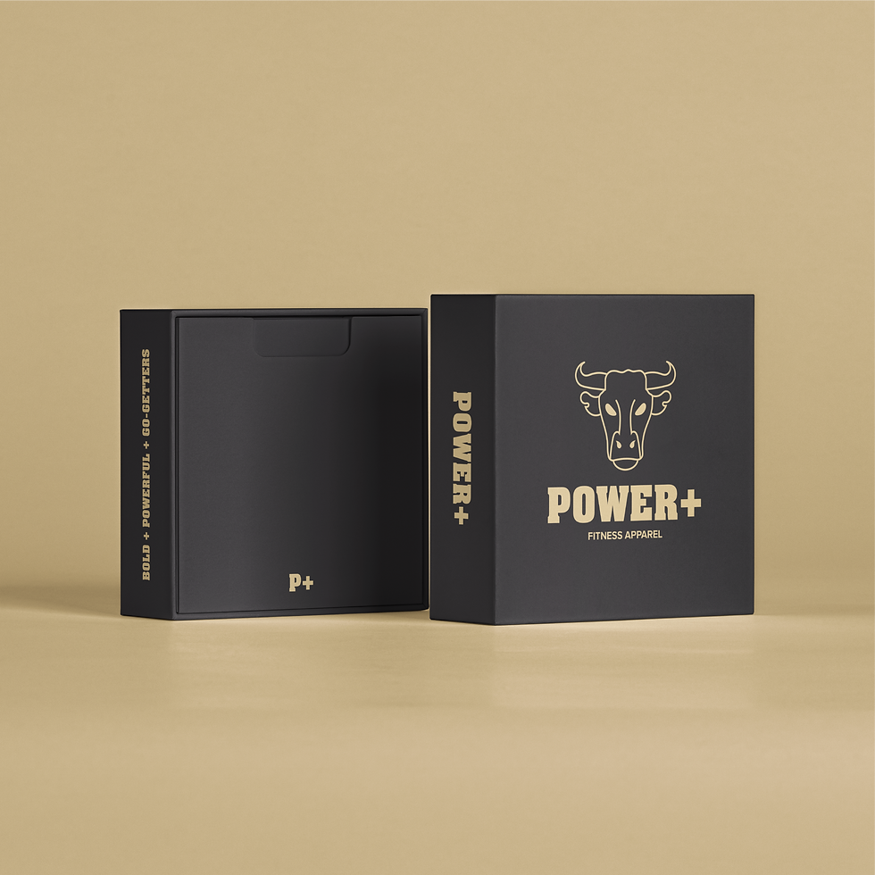
Packaging
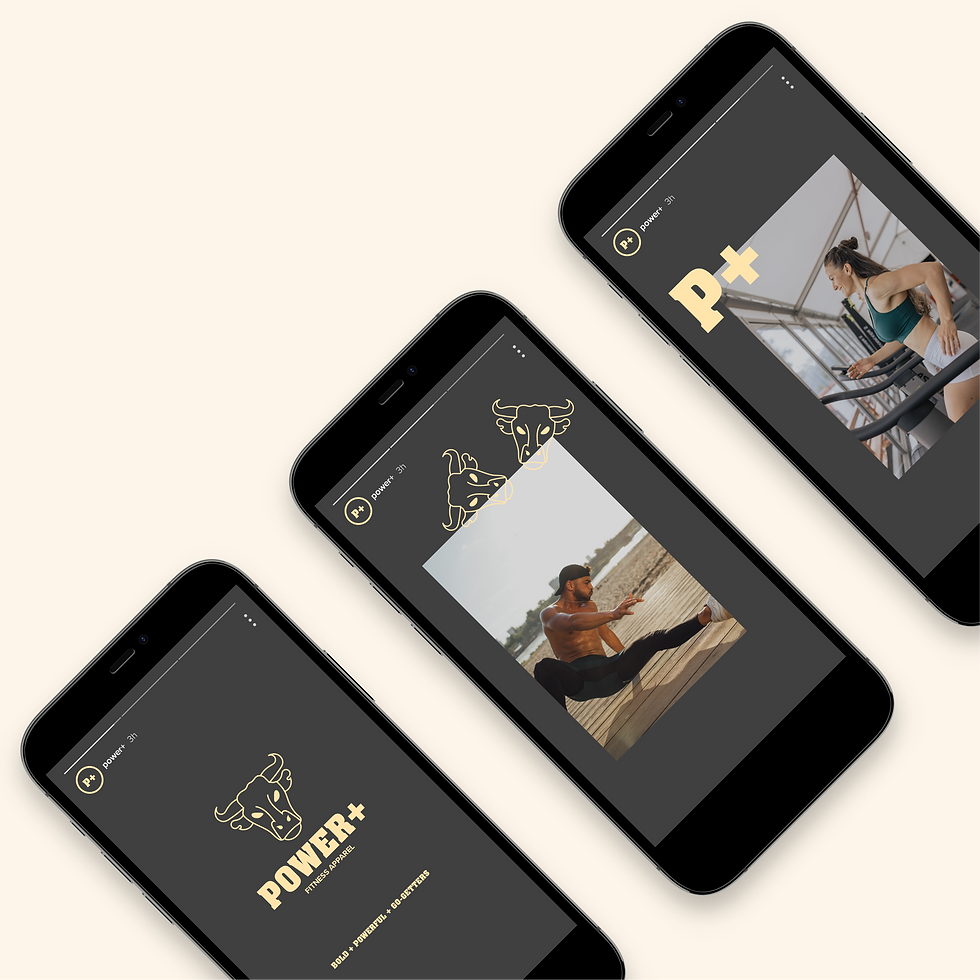
Social Media Assets
Merch Design Assets


POWER+
CREATIVE DECISIONS
01. Logo Exploration 02. The Logo 03. Brand Colors 04. Typography 05. Brand Assets
01. Logo Exploration
An understanding of the Power+ fitness apparel company was needed
to create a logo that expressed their bold, powerful and go-getter mentality.
In the initial steps; research, brainstorm and explorations of the
logo lock-ups were done to bring the logo to life.

A. Brainstorming
Brainstorming helped create a list of ideas to reference when designing the logo. The ideas generated were based on keywords and phrases that described the fitness apparel company and their community, such as; what the brand’s goals are, the age of their community, if they are risk takers, go-getters, looking to get better, the design style for the brand and more. The list of ideas also helped with the generation of brand assets.
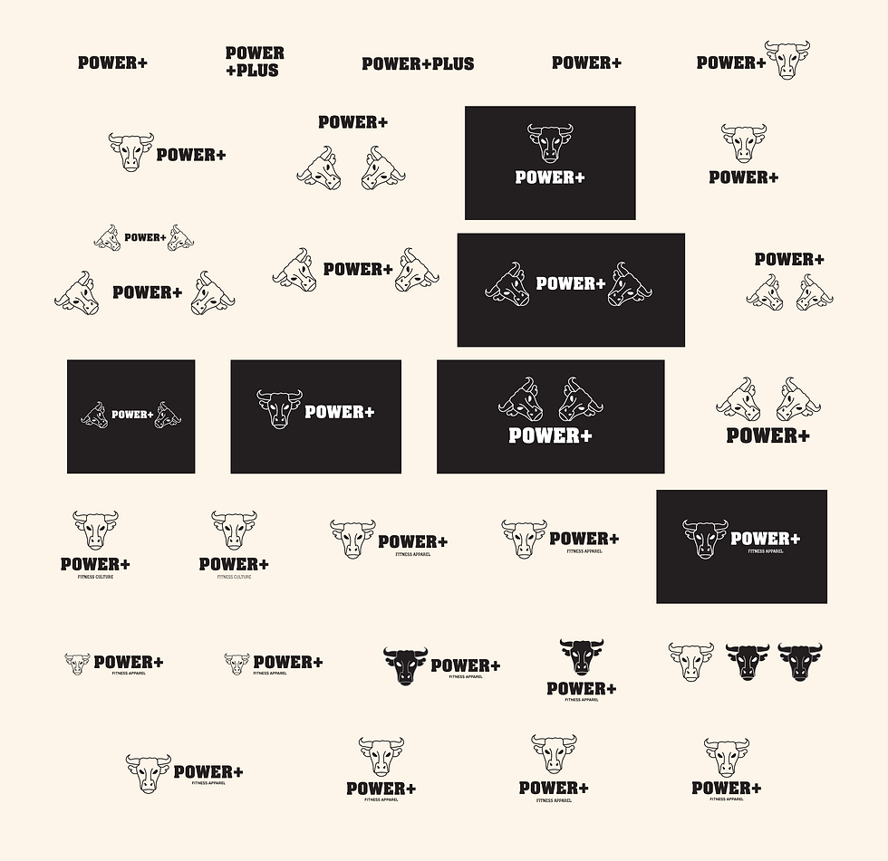
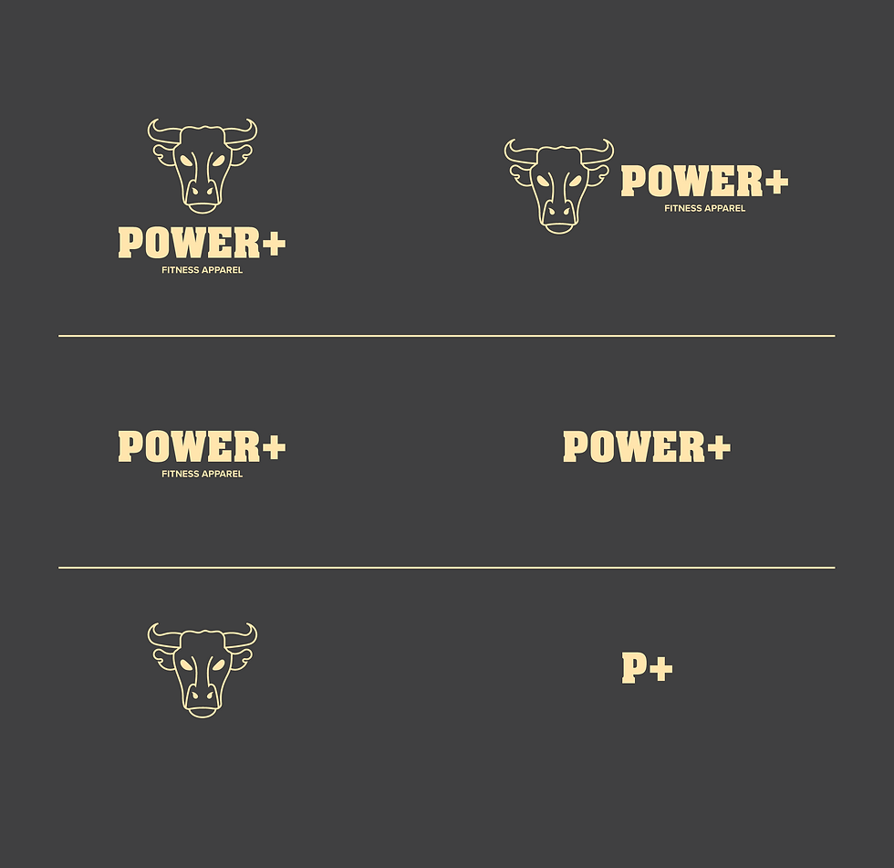
B. Logo Lock-Ups
The Power+ logo needed to be bold and daring just like their fitness community. So, many variations of the logo were explored.
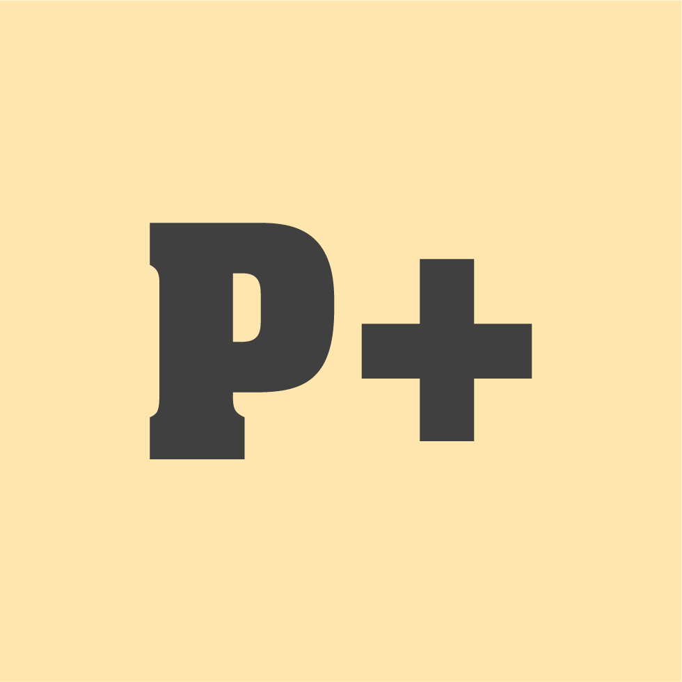
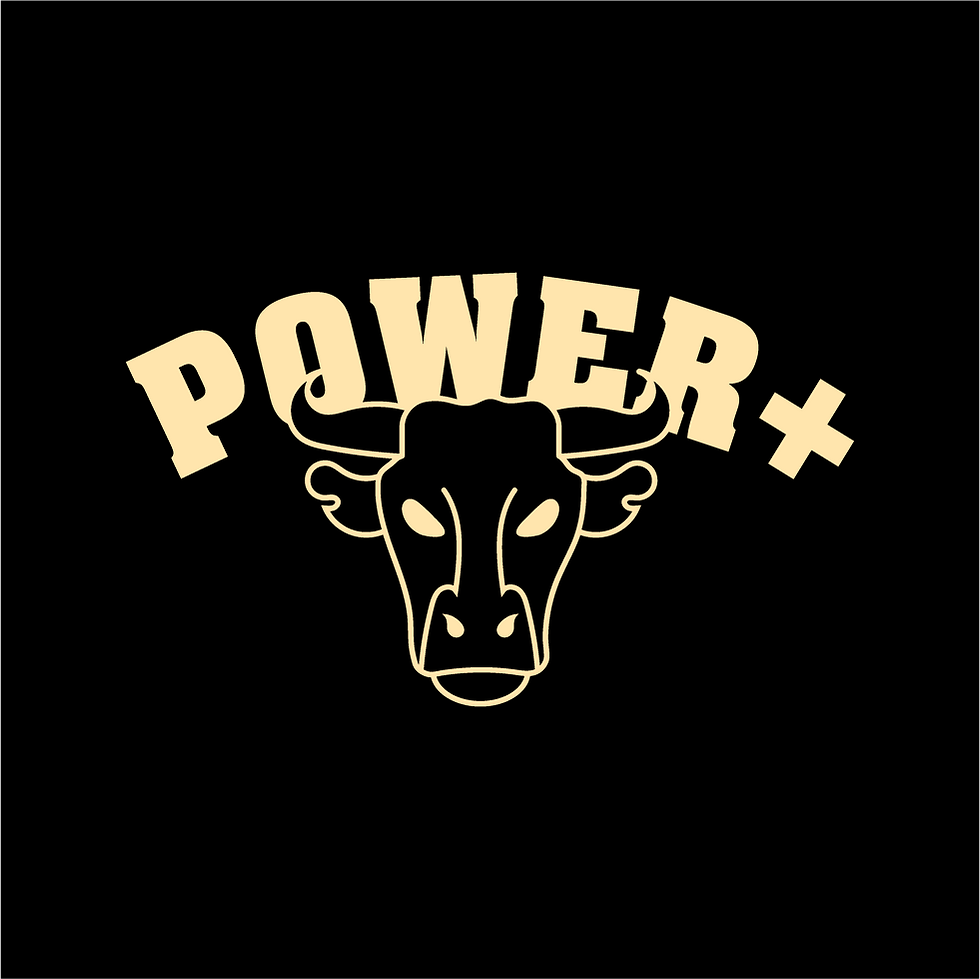
02. The Logo
The Power+ logo is a representation of strength,
strength to do the possible and impossible, in and out of the gym.
For the Power+ brand the bull is their symbol of strength.
The plus sign in the logo signifies that they are more than strength.
Also, to clearly define the sector they are in “FITNESS APPAREL” is found in the logo.
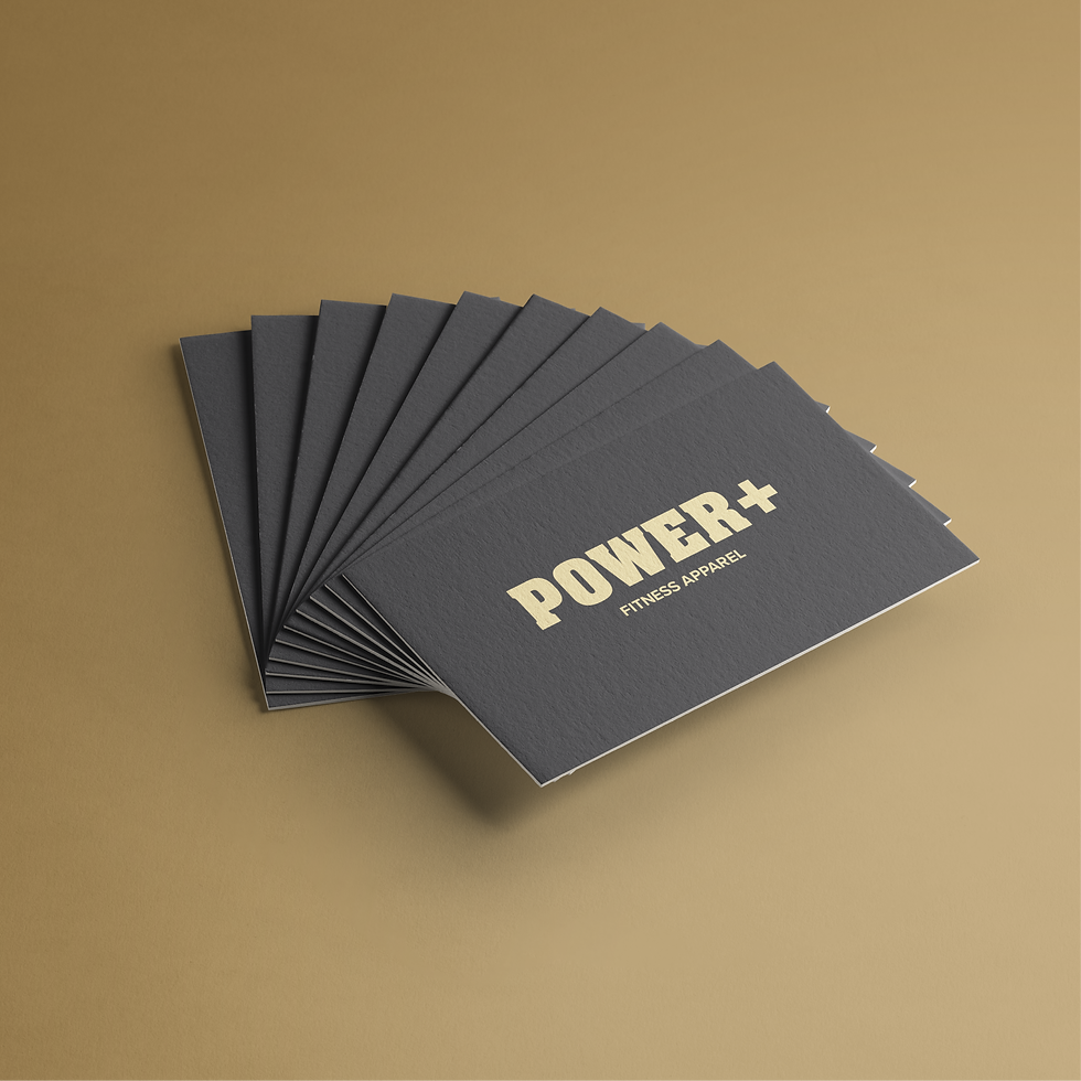
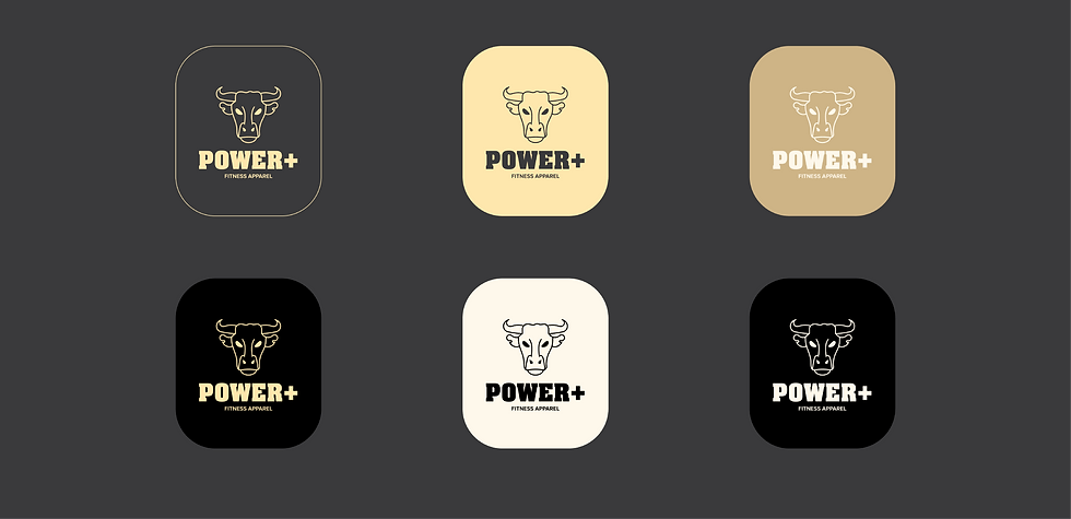
A. Logo Suite
The Power+ logo suite creates brand recognition
even when required in different sizes. The brand identity
will remain identifiable when used on packaging, stationery, website, posters, social media stories, merchandise
and other digital & print collaterals.
03. Brand Colors
The colors selected express strength, control and comfort.
A collection of colors that allows the community to be
comfortable in the journey of accomplishing their goals.
04. Typography
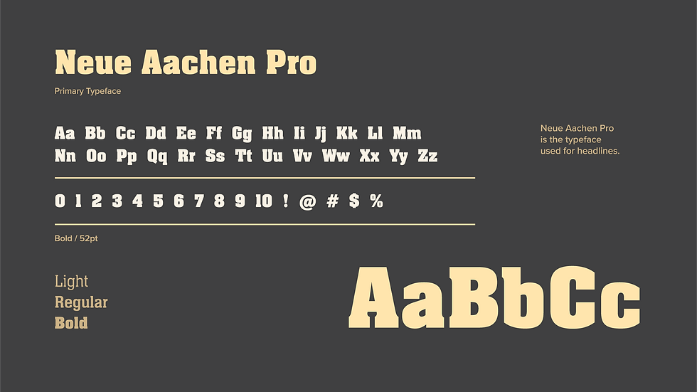
Since a brand like Power+ needs a typeface that is bold and impactful,
one that makes a statement, Neue Aachen Pro fits perfectly.
The secondary typeface, Proxima Nova, pairs perfectly with the primary typeface
and allows the typography to be legible. Together, the typefaces ensure
that everything from headlines to body copy are clean and consistent with the brand,
while creating a bold and empowering environment.

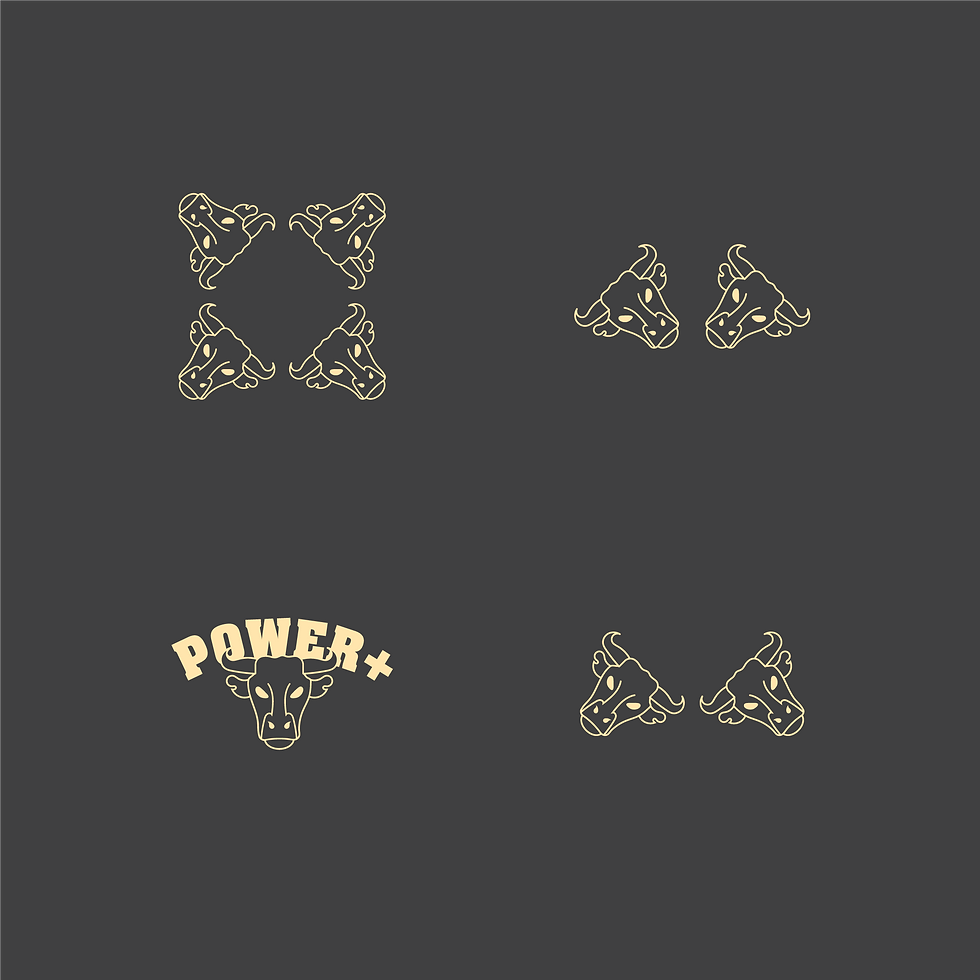
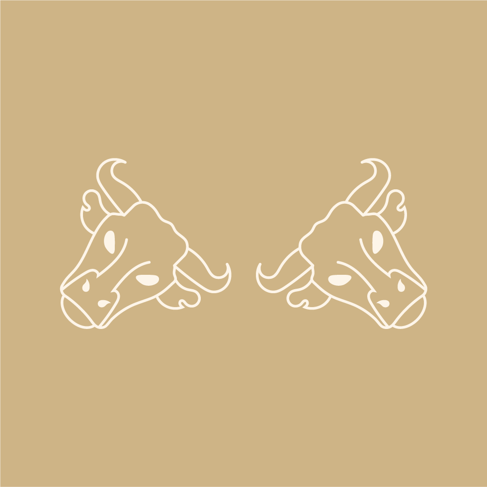
05. Brand Assets
The Power+ brand assets help keep their ecosystem
"on brand" for the fitness apparel company.
These assets will be used for both digital and print purposes.