FOOTBALL
PIVOTING THE PLAY
Pivoting the Play is a football blog with a goal to educate and inform "casual sport aficionados" of the National Football League, NFL. To attract the “casual sport aficionados”, the blog needed a brand identity that gives off a high-end look and feel. The goal was to connect with a community of fans that want to learn more than the basic terminology and rules of the sport but in an engaging and aesthetically pleasing way.
Brand Identity
Stationery
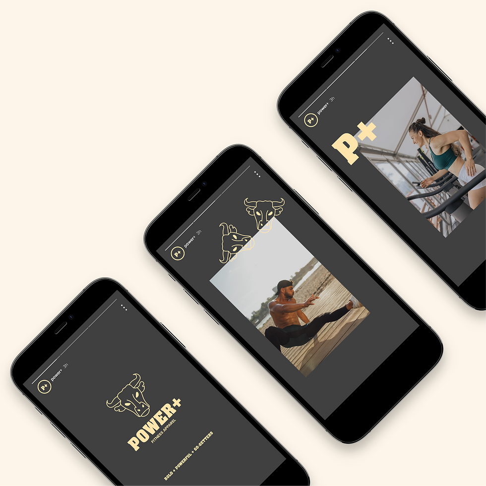
Social Media Assets
Merch Design Assets


PIVOTING THE PLAY
CREATIVE DECISIONS
01. Logo Exploration 02. The Logo 03. Brand Colors 04. Typography 05. Brand Assets
01. Logo Exploration
An understanding of the Pivoting the Play football blog was needed
to create a logo that expressed change and had the “exclusive” look
they were trying to go for.
In the initial steps; research, brainstorm and explorations of the
logo lock-ups were done to bring the logo to life.

A. Brainstorming
Brainstorming helped create a list of ideas to reference when designing the logo. The ideas generated were based on keywords and phrases that described the football blog and the game’s environment, such as; what could potentially impact the win for a team, what the players wear, where do they play, how the teams score points in the game, the goals of the brand and more. The list of ideas also helped with the generation of brand assets.

B. Logo Lock-Ups
The Pivoting the Play logo needed to be unique, show forward progress and change. So, many variations of the logo were explored.
02. The Logo
The Pivoting the Play logo is a representation of change.
In every football game anything and everything
can change the outcome of the play.
Also, since Pivoting the Play covers the Los Angeles (LA) football teams
the L and A in play are combined.

A. Logo Suite
The Pivoting the Play logo suite creates brand recognition
even when required in different sizes. The brand identity
will remain identifiable when used on their newsletters, stationery, website, posters, social media stories, merchandise
and other digital & print collaterals.
03. Brand Colors
The colors selected maintain a consistent
high-end look and feel for the Pivoting the Play ecosystem.
These colors were originally derived from a retro color palette
that the client wanted to include.

04. Typography
Kepler STD is an elegant and playful typeface that helps
Pivoting the Play create an aesthetically pleasing and welcoming environment.
The secondary typeface, Pragmatica, not only helps keep the typography legible
but also embodies the strength that football players have through tackles
and all the physicality that is required in the game. Pragmatica is the perfect typeface to show that strength, specially when using the bold font style.


05. Brand Assets
The Pivoting the Play brand assets help keep their ecosystem
"on brand" for the football blog.
These assets will be used for both digital and print purposes.