BASKETBALL
BATTLE FOR ZOOGOCHO
Battle for Zoogocho is a basketball tournament that happens every year up in the mountains of the village San Bartolomé Zoogocho in Oaxaca, Mexico.
To increase their viewers, both online and in-person, the tournament needed a fun and engaging visual identity that attracts a young audience from nearby villages that enjoy basketball. The goal was to position themselves as
"The Basketball Tournament" and not just any ordinary tournament.
Visual Identity
Stationery
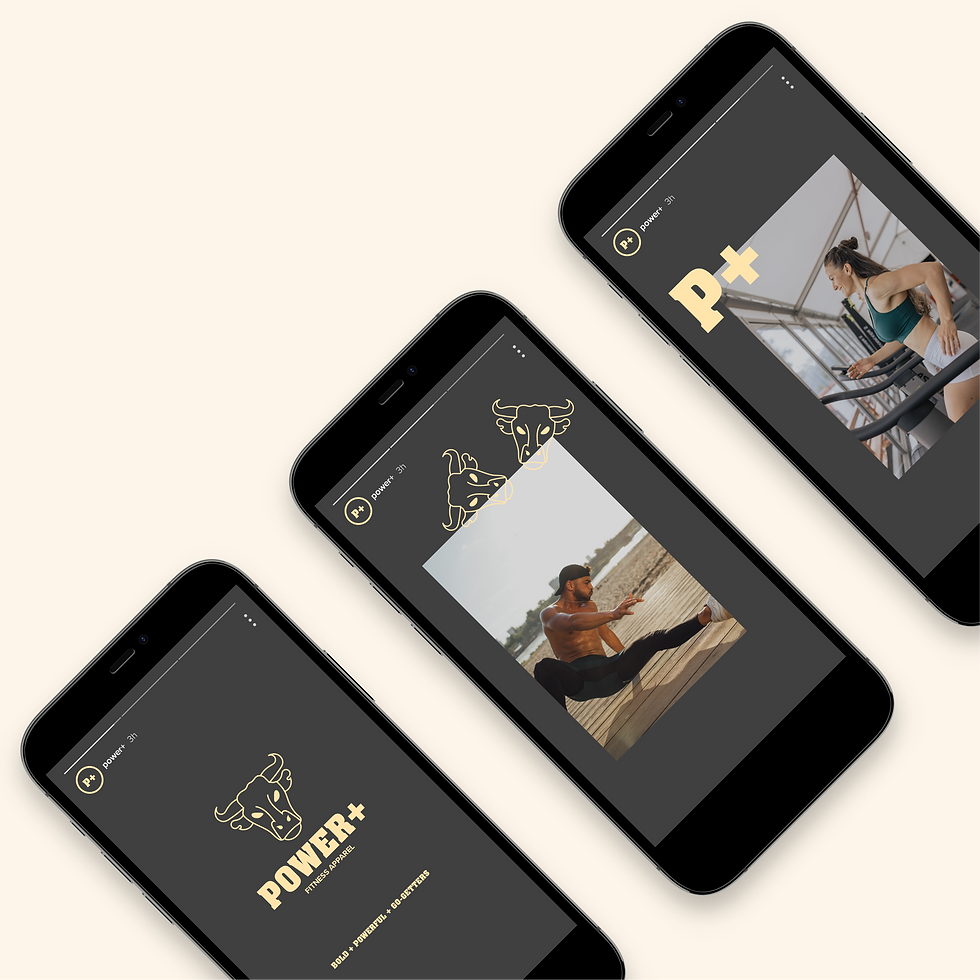
Social Media Assets
Merch Design Assets


BATTLE FOR ZOOGOCHO
CREATIVE DECISIONS
01. Logo Exploration 02. The Logo 03. Brand Colors 04. Typography 05. Brand Assets
01. Logo Exploration
An understanding of the Battle for Zoogocho tournament was needed
to create a logo that was modern and unique to the location of their village.
In the initial steps; research, brainstorm and explorations of the
logo lock-ups were done to bring the logo to life.

A. Brainstorming
Brainstorming helped create a list of ideas to reference when designing the logo. The ideas generated were based on keywords and phrases that described the basketball tournament and it’s environment, such as; the weather, location, how the basketball tournament was going to be viewed, what age the audience would be, any prizes to be won and more. The list of ideas also helped with the generation of brand assets.

B. Logo Lock-Ups
The Battle for Zoogocho logo needed to identify the sport being played and at the same time showcase that the tournament takes place at a village up on the mountains, at "high elevations." So, many variations of the logo were explored.
02. The Logo
The Battle for Zoogocho logo represents the high elevation
of the village and the sport played there, basketball.
Since the village is on a mountain, the structure of the logo
is in a mountain like shape. Also, in the logo there are five stars
representing the five basketball players that play on the basketball court,
at a time, for each team.

A. Logo Suite
The Battle for Zoogocho logo suite creates brand recognition
even when required in different sizes. The brand identity
will remain identifiable when used on jerseys, basketballs,
stickers, snacks, posters, social media stories, merchandise
and other digital & print collaterals.
03. Brand Colors
The colors selected were inspired from the village of
San Bartolomé Zoogocho which is in a region called Sierra Juarez.
Zoogocho is located in the "Tierra Caliente" area of the Sierra Juarez,
which is represented by the orange colors.
The other colors were derived from the agriculture (milpas and corn)
and the dark but beautiful night skies.

04. Typography
Since the tournament is happening in a village where you find
dirt roads, fields, houses surrounded by nature, the Cubano typeface
fits perfectly for the brand.
The secondary typeface, Forma DJR Micro, helps keep the typography legible.
Together, the typefaces ensure that everything from headlines to body copy
are clean and consistent with the brand, while creating a friendly
and welcoming environment.


05. Brand Assets
The Battle for Zoogocho brand assets help keep their ecosystem
"on brand" for the basketball tournament.
These assets will be used for both digital and print purposes.